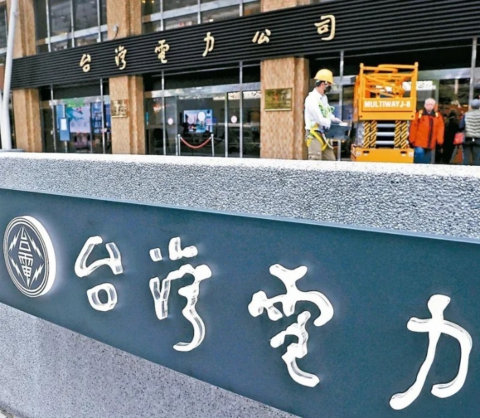
Recently, the Taiwan Electric Power Company (Taiwan Power) has spent nearly one million nt dollars (NT $, the same below) to replace its corporate logo, and to redesign the new version of the logo through a new tender, in order to replace more than 70 years of use, written by the calligrapher Yu Youren Old version of the logo, in the island caused a series of disputes. From the criticism of“Losing cultural heritage” to the questioning of whether there is interest transfer in the bidding process, this bid-changing storm has evolved into a political and public opinion storm.
According to a report by Taiwan’s“China Times” on the 9th, Taiwan Power is celebrating its 80th anniversary this year and will optimize its corporate identification system, originally written by Yu Youren, a calligrapher and former“Minister of supervision” in Taiwan, the six characters for“Taiwan Electric Power Company” have been re-commissioned, by the island pro-green designer Nie Yongzhen“Yongzhen urgent system design studio” to nearly 97 million won the bid. According to the report, the font of the new logo is“More like an ordinary computer font”, removing the original“Handwriting” style, and the lightning shape inside the circular icon has also changed simultaneously. According to the company, it is a common brand strategy for corporate logos to change with the times, and the change is to“Meet the needs of the digital age” and“Make the brand younger”.
In this regard, many people on the island regret that Taiwan Power’s new logo“Has lost the quality of calligraphy characters and the sense of culture,” while others criticize that Taiwan power now faces a huge loss of more than 300 billion yuan, it was even necessary to spend a lot of money to change the logo. Some people criticized Taiwan power chairman Zeng Wensheng for kissing up to the DPP authorities and engaging in so-called“Transformational justice.”.
Yu Youren was a pioneer of the 1911 revolution, a veteran of the Kuomintang, and a patriotic poet. Before his death in Taipei in the 1960s, he wrote his masterpiece“Looking at the mainland” to express his yearning for the mainland. Former“Legislator” Shen Fuxiong 10 criticism, Taiwan’s logo change is not a simple“Aesthetic change”, the essence is to“Go”, “Both ridiculous and ridiculous.
Kuomintang“Legislator” Wang Hongwei criticized in an article on social media that according to Taiwan Power’s accounting settlement data, its financial situation continues to deteriorate, “Under such a difficult situation in the books, we spent money to change the logo under the pretext of ‘being young’ . . . I wonder how Taiwan Power sells products that need to be young to have sales?” Ms Wang further disclosed, nie Yongzhen, the winner of the bid, is a“Green friend.” He was in charge of the visual design of Tsai Ing-wen’s campaign in the Taiwan leadership election. During Tsai Ing-wen’s term in office, nIE yongzhen“Has become a frequent guest in designing tenders for various governments and public undertakings. It is an indisputable fact.” He has successively won tenders for the Ministry of Communications, China National Petroleum Corporation, and Taiwan Power.
KMT“Legislator” ye Yuanzhi also said that Taiwan Electric is clearly losing money, and there is no need to change the logo at all. Changing the logo now makes the public feel that it is not worth it, “Doesn’t Taiwan power have anything else to do?” Ye yuanzhi pain criticized: “This money could have been spent, how much of the budget of the Democratic Progressive Party is for these ‘Green Friends’ ?” Taiwan’s United News Network said on the 9th, the public has long seen through and questioned the 900,000 yuan bid case. How much money will Taiwan Power, which has already lost more than 300 billion yuan, actually spend on replacing the logo? I don’t know how many“Green Friends” will benefit.
Faced with many questions on the island, Taiwan Power said on the 10th that Taiwan Power would register the old and new logo fonts and use them in a“New and old combination and compatibility” way, calling the Yu Youren inscription used in the current buildings a common memory, the new fonts will be used in digital products, business cards of TT & C employees and publications.
Huang Zhiyang, a calligrapher on the island and Dean of the School of Humanities and Arts at Huafan University, posted historical materials on social media detailing the process of inscriptions specially requested by Taiwan Radio and television at the time. According to the information article, at that time, Taiwan power asked Yu youren to write“Taiwan electric power company” and“Service office” as a signboard. Taiwan Power’s people went to pay respects with two pieces of good rice paper, for right ren said“Taiwan’s units throughout the province, can have the right old ink treasure, not only for Taiwan Electric Glory, and will be immortal together with the island”. Yu right ren listened to very happy, not only a promise, and less than 3 days to write, “Now the province’s units of all sizes used ‘in the body’ Taiwan Power Company signs, are written that time.”. The people of Taidian took two large watermelons to thank them a few days later. There were many guests in the reception room at that time. When Yu Youren saw such a large watermelon, he immediately asked someone to cut it up and share it with the guests.
In response to TTC’s claim that“The logo change is to be closer to the younger generation,” Huang Zhiyang said that the original logo was distinctive and natural, and felt“Closer” to any age group, don’t underestimate the young people’s judgment on the font style, Taiwan’s“Spent money and fear to become the international culture brand design discussion in the negative teaching material.”. Public opinion in the island said, “Taiwan is worth leaving Yu Youren’s ink as a symbol of Taiwan power, it is a cultural heritage, but also a kind of feelings, but also a selfless dedication.”. The island’s senior media xie hanbing choked, “Nie Yongzhen that font, you call AI do it directly.”.
According to a report by Taiwan’s China Times News Network, the YouTube channel“Impolite villagers group”, which has 257,000 followers, conducted an online poll on“Which version of Taiwan Power’s new logo do you think looks better?” As a result, 93 percent of netizens thought the yu youren version (the old version) was better. Some netizens criticized Tsingtao saying, “Can we do something serious?”“Just because we can’t do serious work, we have to constantly manipulate ideological things, making people feel that they are doing something, which is actually equivalent to not doing anything.”. Others criticized, “Rather than spend thought to change the logo, think of ways to turn a loss into profit, do not waste people’s public funds.”.
Taiwan’s“United Daily News” 9 editorial said, Taiwan electricity logo changes related to cultural literacy. The editorial warned that in the pursuit of“Youthfulness”, please do not forget that once something is taken off, it can not be hung back.